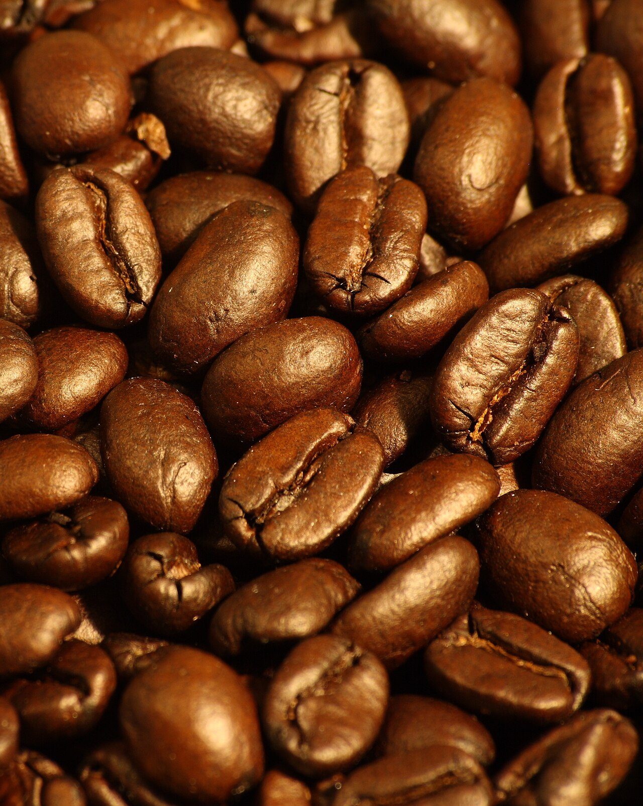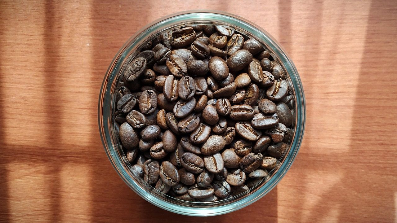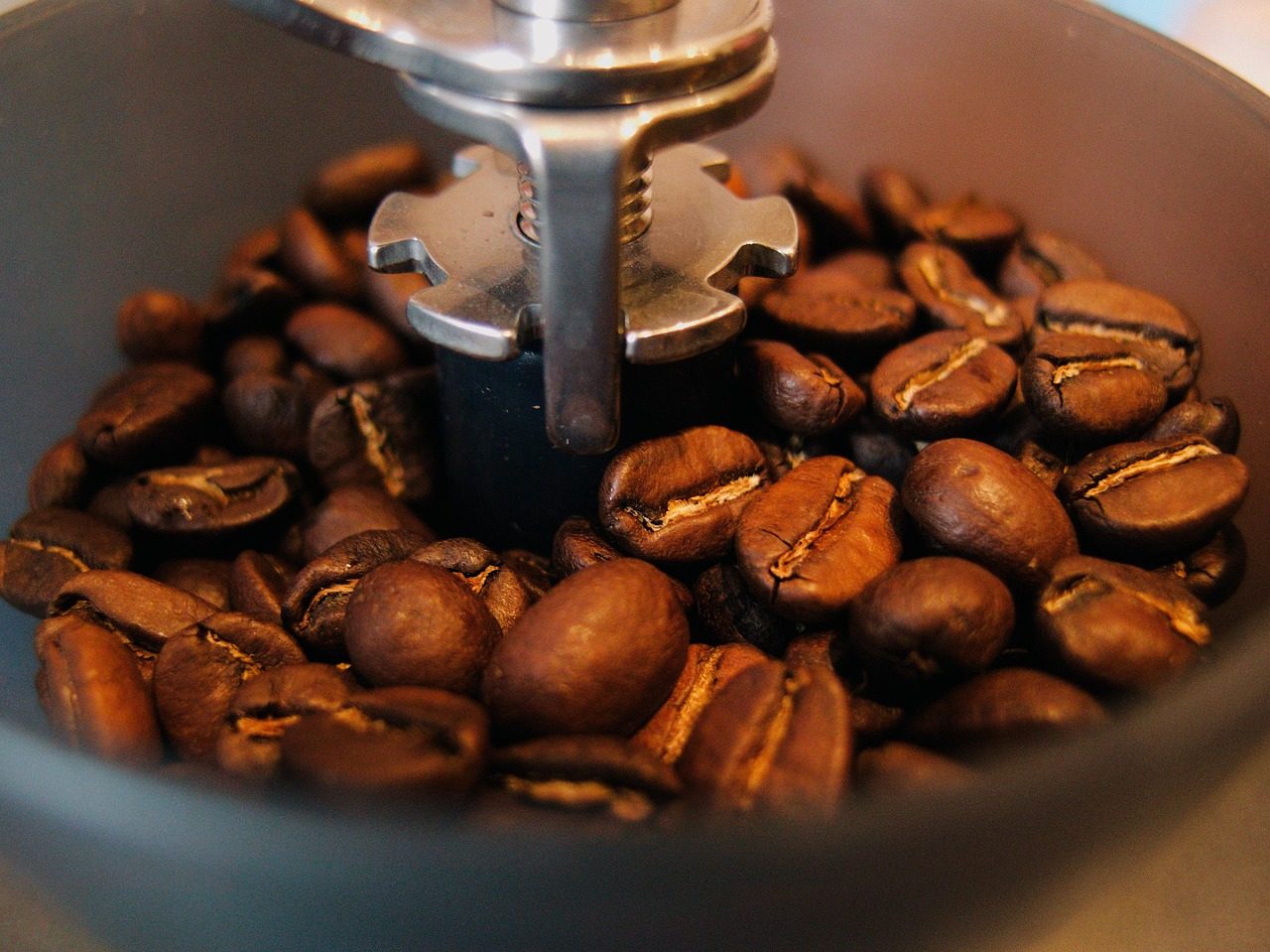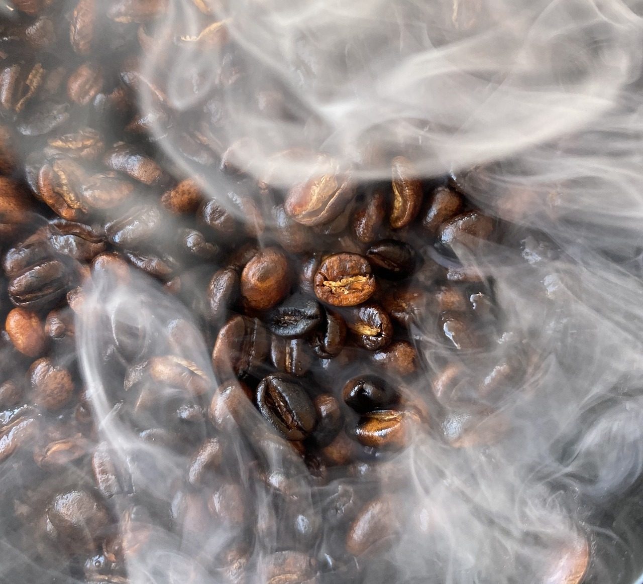
Light roast
Light roast Ethiopian beans
Jasmine, bergamot and white peach. A bright, tea-like cup that shines as pour-over.
£16.00 / 250g
The spacing scale, containers, section rhythm and grid utilities shared by every Harbor Coffee Roasters template.
Colour
Warm browns and cream with a roasted-copper conversion colour. Each swatch is labelled with the readable brand foreground and its measured contrast ratio.
--color-primary-50
#fdf6f0
14.66:1 · AA text
--color-primary-100
#f8e5d4
12.81:1 · AA text
--color-primary-200
#efc7a6
10.01:1 · AA text
--color-primary-300
#e2a271
7.20:1 · AA text
--color-primary-400
#d07c42
4.96:1 · AA text
--color-primary-500
#b85f23
4.15:1 · large text only
--color-primary-600
#a34e17
5.33:1 · AA text
--color-primary-700
#7d3a12
7.84:1 · AA text
--color-primary-800
#5f2d10
10.43:1 · AA text
--color-primary-900
#401e0b
13.84:1 · AA text
--color-accent-100
#fbefc6
13.65:1 · AA text
--color-accent-200
#f6dd8c
11.69:1 · AA text
--color-accent-300
#f0c653
9.64:1 · AA text
--color-accent-400
#e3a92a
7.45:1 · AA text
--color-accent-500
#c98f18
5.55:1 · AA text
--color-accent-600
#a87214
3.84:1 · large text only
--color-accent-700
#8a5712
5.65:1 · AA text
--color-accent-800
#6b4312
8.00:1 · AA text
--color-neutral-50
#faf6ef
14.57:1 · AA text
--color-neutral-100
#f3ebdd
13.25:1 · AA text
--color-neutral-200
#e7dac6
11.39:1 · AA text
--color-neutral-300
#d5c3a8
9.12:1 · AA text
--color-neutral-400
#a48d74
4.96:1 · AA text
--color-neutral-500
#7a6450
5.18:1 · AA text
--color-neutral-600
#5c4733
8.11:1 · AA text
--color-neutral-700
#432f1f
11.71:1 · AA text
--color-neutral-800
#2f2015
14.57:1 · AA text
--color-neutral-900
#20150d
16.60:1 · AA text
Typography
Fraunces, a serif, for headings; Source Sans 3 for body copy. Every heading step is a fluid clamp(), so type scales with the viewport instead of jumping at a breakpoint, while body copy stays at 16px with a 1.65 line-height.
Accessibility
Every interactive element shows a 3px ring on keyboard focus. The samples below render the ring permanently so it can be checked in a screenshot, on each of the three surfaces the theme uses.
--focus-ring-color on --color-bg,
7.84:1 against its surface (meets the 3:1 non-text minimum). --focus-ring-color-inverse on --color-neutral-900,
13.32:1 against its surface (meets the 3:1 non-text minimum). --focus-ring-color-on-primary on --color-primary-600,
3.12:1 against its surface (meets the 3:1 non-text minimum). Spacing
An 8px-based scale. Layout utilities only ever consume these tokens — never arbitrary pixel values.
Rhythm
Every band is a .section (vertical rhythm) wrapping a .container (max-width plus adaptive gutters).
--space-section--space-section-sm--space-section-lg--container-gutterBreakpoints
Base styles target the smallest screen. Every media query in the theme is min-width only.
Grids
All three collapse to a single column below 600px.
Buttons
Copper is the only conversion colour. Every button is at least 44px tall, keeps a 3px focus ring on keyboard focus, and dims when disabled.
Editor buttons inherit the same shape through targeted selectors, so block content never falls back to browser defaults.
Forms
Every control is built by harbor_coffee_roasters_form_field(), which always renders a visible label tied to the input by id. Placeholders are hints only.
We only use this to reply to your enquiry.
Enter a volume of 1kg or more.
Media
Images are capped at max-width:100% with height:auto, so nothing overflows a 320px viewport.
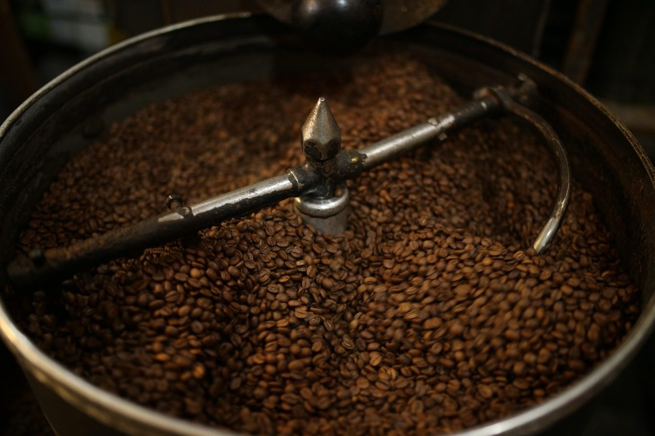
Stacked on mobile, 60/40 from 900px up. Use .split--reverse to put the media on the right, or .split--even for equal halves.
Components
template-parts/components/hero.php — full-bleed photography behind the token gradient overlay, a display heading and up to two CTAs. The hero image is the only image on a page that is not lazy-loaded.
Roasted in small batches
Beans sourced season by season and roasted the morning they ship.
Components
.card--product in a .grid--4: one column on mobile, two from 600px, three from 900px and four from 1200px. The whole card is a single link, so there is one tab stop per card.
Light roast
Jasmine, bergamot and white peach. A bright, tea-like cup that shines as pour-over.
£16.00 / 250g
Dark roast
Dark chocolate, toasted hazelnut and molasses. Built for milk drinks and a syrupy shot.
£15.00 / 250g
Medium roast
Red apple, brown sugar and almond. Our most versatile bag — equally good filter or espresso.
£14.50 / 250g
Subscription
A rotating bag chosen by our roasters, posted the morning after it is roasted. Pause any time.
From £13.50 / month
Components
.card--article crops its media to 16:9 and renders the date in sentence case; .card--feature drops the border and shadow for quieter "our craft" strips.
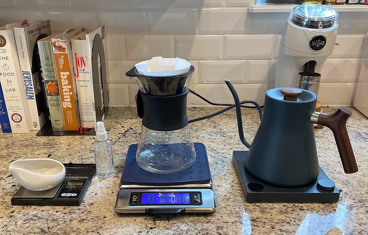
Ratio, grind and pour rate — the three dials that move a cup from flat to floral.
Why the same bag tastes sour in a V60 and bitter in an espresso basket.
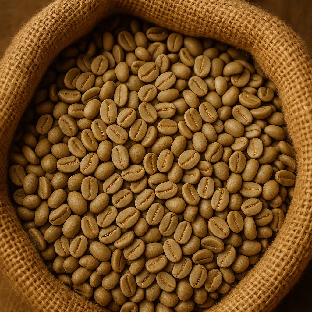
We buy from the same farms year after year and publish what we paid. A feature card carries no link, so it stays out of the tab order.
Components
.card--testimonial has no media: a serif-scale quote, the attribution pinned to the bottom of the card and no link at all.
The Ethiopian is the first bag that made me want to weigh my coffee. Roast dates on every label, and it arrives the next morning.
We pour Harbor across all three of our cafes. Consistent espresso, honest sourcing and a team that actually answers the phone.
I came in for a bag and left with a brewing lesson. The guides on the site are what finally fixed my grind size.
Bands
Cards keep their cream surface on a dark band, so cards.css restates the text colours there — never light text on a light card.
Light roast
Jasmine, bergamot and white peach. A bright, tea-like cup that shines as pour-over.
£16.00 / 250g
Dark roast
Dark chocolate, toasted hazelnut and molasses. Built for milk drinks and a syrupy shot.
£15.00 / 250g
Bands
Section backgrounds and text colours both come from tokens, so every band stays readable as a pair.